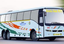
Yeah, At last it happened. Now the website got a new look. But it’s not a complete new template. It’s like the re-conditioning of buses which met with accidents. KSRTC is well known for the re-conditioning process of buses. They make big “Chaddi’s” by the Re-built of buses. RR 219 – Ac bus is the great example for that.
Now, KSRTC has changed its website design and has completely revamp the home page.
Here is the link for the website (http://www.keralartc.com)
I think, it’s a good beginning for KSRTC by revamping the website by adding some extra stuffs to the homepage. There is a lot more to be done to be called as a good travel resource site. Still it’s not comparable with the website of Karnataka RTC.
Changes At A Glance!!!
1) Top portion or header remain same. Added a “Flash news” like section under the header.
2) Added “About Us” Page as a section “Welcome to KSRTC” with read more link.
3) Added a new page for “Pamba special services” under the section “Latest News”
4) Under the two blocks of Welcome and latest news, they have added three sections Online, Tender, Offices with the link to Online reservation, Tender and Depot pages respectively.
5) Updated almost all the pages. But still the Managing director is Mr. T.P Senkumar (According to the official website)
6) Footer section is almost similar to KSRTCBlog.com. Footer is divided into three, and a black and white logo of KSRTC is placed on the left, Important contact numbers on the middle and Some links and email address on the right.
7) In addition to that, they have added footer text as “Copyright: Electronic Data Processing Centre, Transport Bhavan, KSRTC. All rights reserved”
First, Positives:
1) Site appears clean and neat from the looks point of view. (Only for home page)
2) It offers the feature to make a ticket reservation.
3) It seems to offer a peek into the KSRTC information including RTI information.
4) The present layout and design is fit for the site.
Negatives:
1) Looking at the home page one can easily make out that this website is not meant for General public to access data.
2) Travel related information is hardly about 5%. As many of you noted, 95% of information is about KSRTC Organization.
3) No options to get the Time Table of buses.
4) Information is not organized in logical sections.
5) No consistency in presentation aesthetics – Every page has a different appearance.
6) No feature to download travel related information for route maps, tourist destinations or places of importance
7) No Feature to obtain information on Dep / arrival status.
8) No feature to trip planning.
9) No feature to obtain local information of destination cities and towns.
10) No information on location, map and Public transport choices to reach the specified bus stations.
No sign of any discounts or deals.
11) I think this list and other feedback should have covered majority of the main functions that KSRTC’s website is not offering this time.
http://busfanning.com/gallery/
Visit Our Forum here
http://forum.https://www.aanavandi.com/blog
Visit video Blog Here
http://videos.https://www.aanavandi.com/blog


